Course Insights
“Learning Analytics is the collection, analysis, interpretation and communication of data about learners and their learning that provides theoretically relevant and actionable insights to enhance learning and teaching.” (SoLAR* 2025)
We are pleased to announce a new learning analytics tool, Course Insights, now available within Canvas!
*Society for Learning Analytics Research
Course Insights Heading
What is Course Insights?
Course Insights presents a series of instructor dashboards on key performance, engagement, and demographic information about students within your courses.
This tool was developed at the University of Nebraska especially for our instructor community which means that we are very excited to hear your feedback so that we can make improvements! If there are items you would like to see added or updated, please feel welcome to reach out to us at any time with your questions and suggestions by using the Course Insights Feedback form.
The dashboards in Course Insights are updated nightly, providing near real-time insights into the course in focus.
Why use Course Insights
Why use Course Insights
- Course Insights provides a detailed analysis of assessment outcomes and behavior patterns in Canvas for both the class and individual students.
- This analysis helps create a comprehensive awareness of the current course cohort as the semester progresses.
- With this information, instructors can quickly identify students who need attention or intervention to successfully complete the course.
- Instructors can also use these insights to reflect on and adjust their teaching strategies as needed throughout the semester.
How to Access Course Insights
How to access Course Insights
Course Insights is available to instructors only; to utilize Course Insights, you will need to either access your Canvas course from campus or ensure that you are connected to the campus Virtual Private Network.
Then,
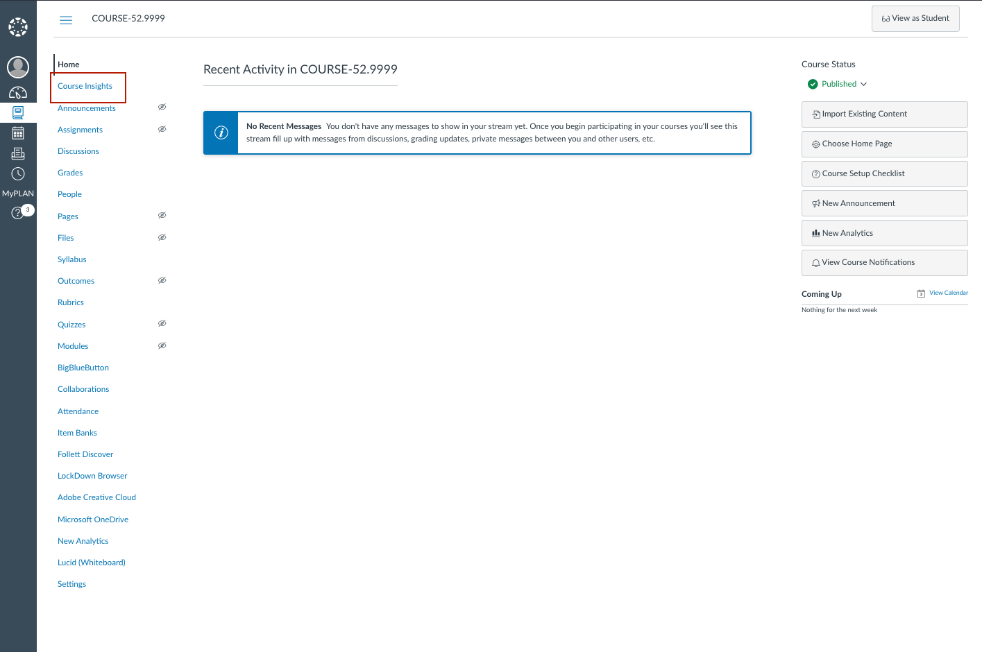
- Sign into Canvas as usual
- Click on your course shell of interest
- Click on Course Insights from the navigation items on the left menu inside the course shell as show in the image on the left.
the dashboards
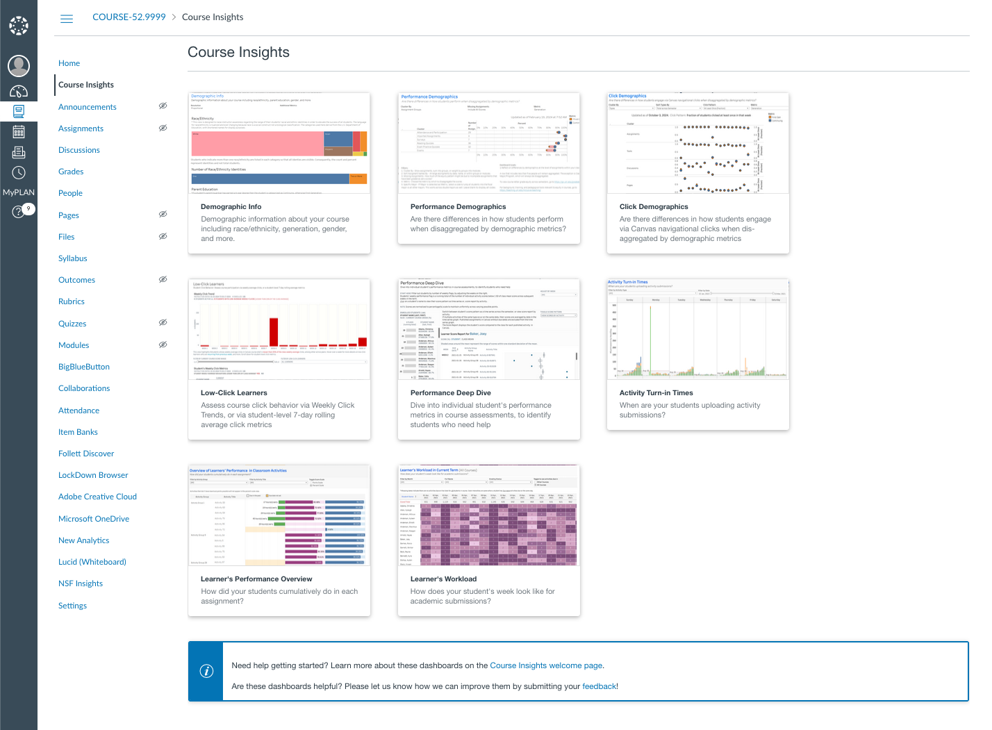
The Dashboards
Course Insights currently provides a suite of eight dashboards, each offering valuable insights into different aspects of student data. Three dashboards focus on demographics as part of the UNL Demographic Suite, two analyze student engagement, another two track and highlight student performance outcomes, and one outlining students’ workload throughout the semester, contributing a perspective on potential influences on class’s click behavior and academic performance.
demographicInfo
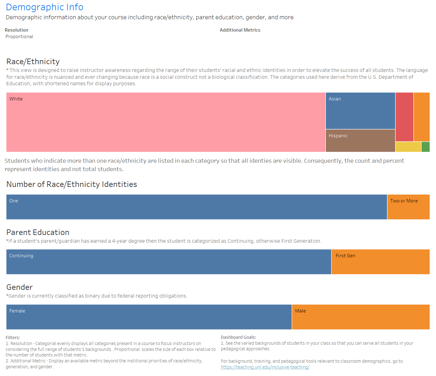
Demographic Info
The Demographic Info dashboard allows you to visualize the demographics within your course in multiple dimensions. Instead of implicitly assuming students align with a majority or idealized background, this allows you to explicitly consider the different backgrounds of the students in their course.
It highlights metrics of race/ethnicity, gender, and parent education, while enabling you to consider additional metrics of major, state residency, starting status, rural/urban, neighborhood index, country of origin, GPA, and class standing.
For students that have multiple identities in race/ethnicity or major, all identities are displayed in the visualization. You can switch to a categorical view, as opposed to proportional, to foster the mindset of teaching equally to all categories of students in your course.
performance demographics
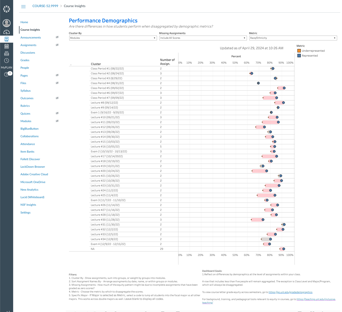
Performance Demographics
The Performance Demographics dashboard allows you to reflect on demographic differences within your course based on similar dimensions as visualized in the Demographic Info dashboard.
The average grade on an assignment can be disaggregated by a demographic metric. Assignments can be clustered by individual assignments, assignment groups, or modules. You can remove zero scores to examine their influence on the gaps.
A link at the bottom of the dashboard provides access to pedagogical resources for closing gaps, and another link provides a dashboard on letter grade differences across semesters.
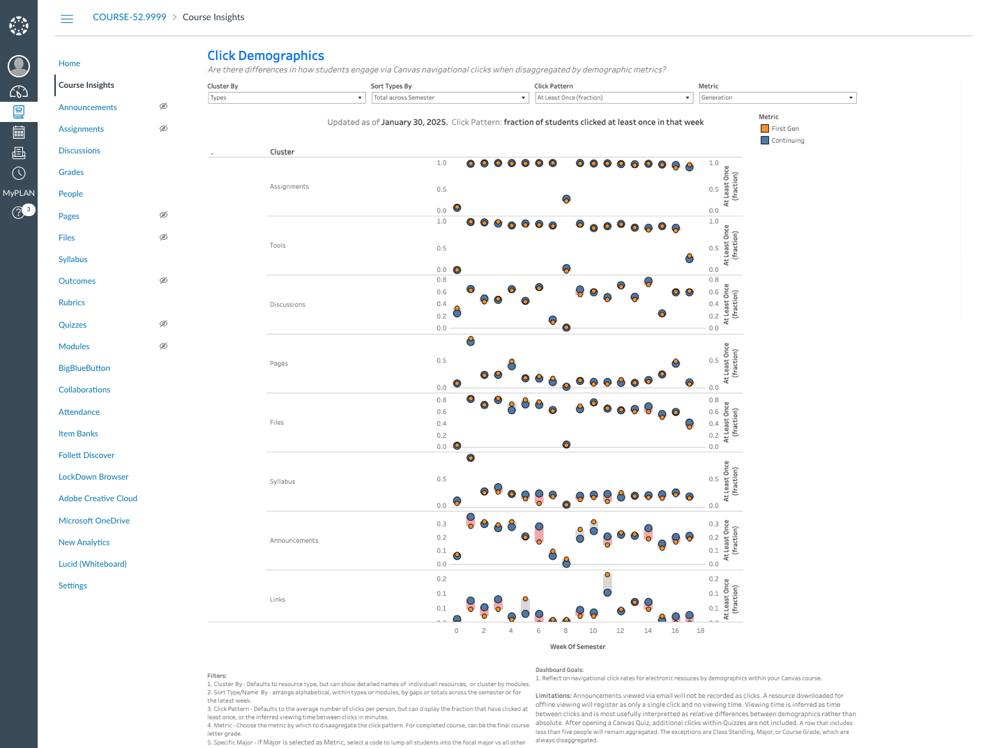
clicl demographics
Click Demographics
The Click Demographics dashboard allows you to reflect on navigational clicks disaggregated by similar demographics to those in the Performance Demographics dashboard. Navigational clicks can be quantified as the average clicks per week, the fraction of students who clicked at least one, or the inferred viewing time on educational resources in Canvas such as pages, discussions, syllabus, announcements, files, and links. Clicks can be viewed in aggregate by type, by module, or as individual resources.
low-click-description
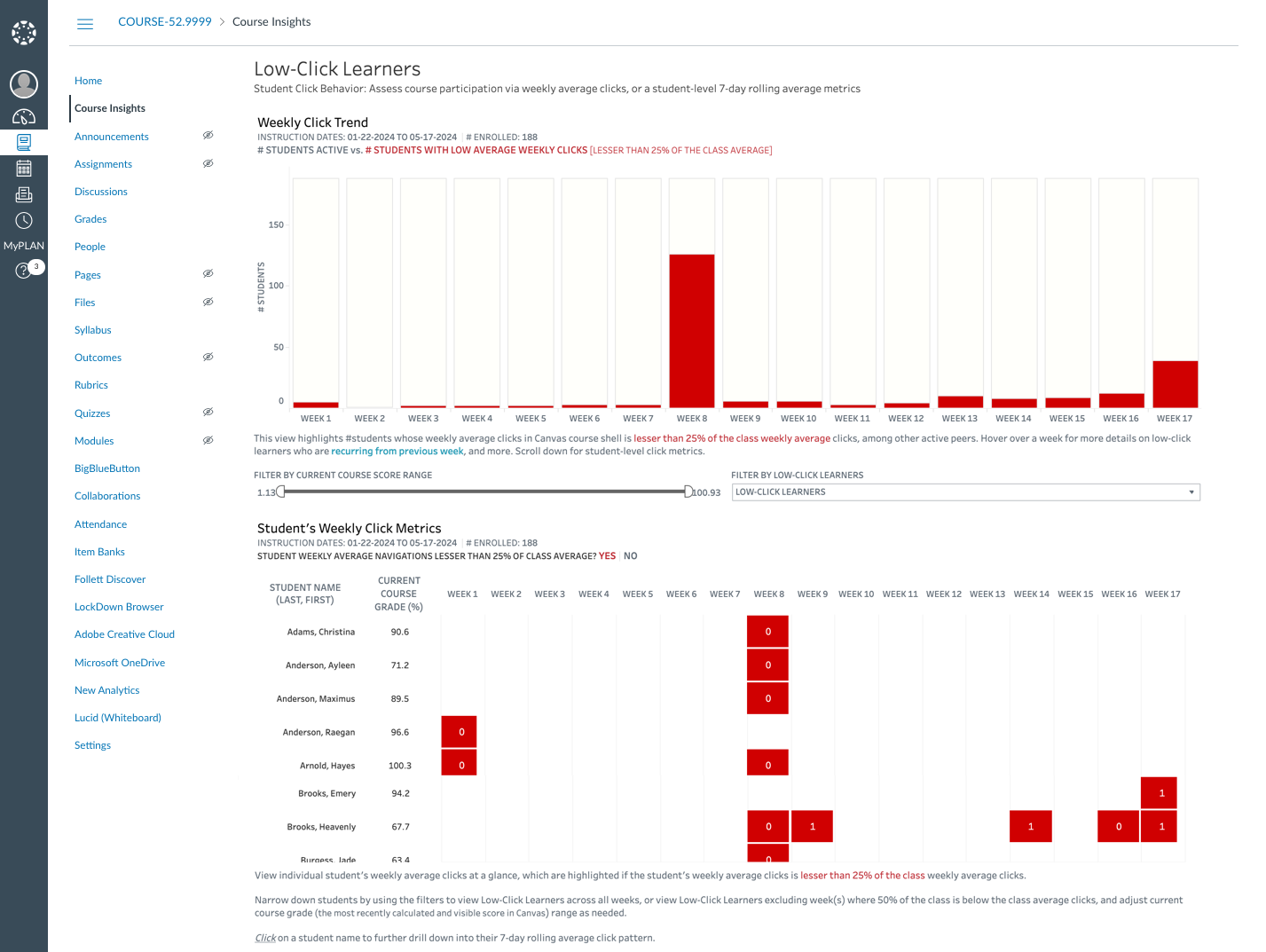
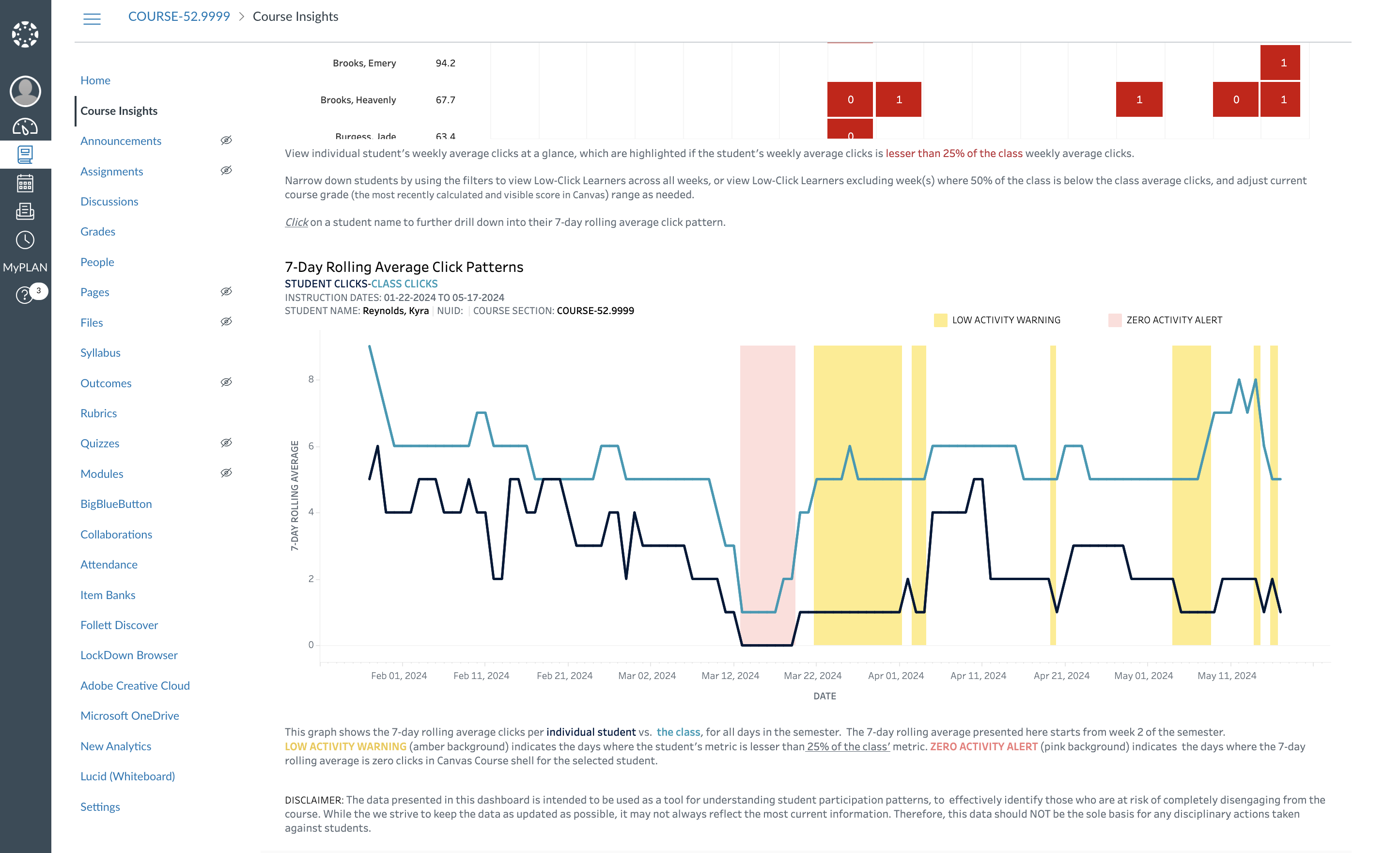
Low-Click Learners
This dashboard focuses on student engagement drop-offs within the course by tracking their click activity in Canvas. It provides insights into student participation by analyzing weekly average clicks and student-level 7-day rolling average click metrics. The primary view highlights students whose weekly click activity falls below 25% of the class average, indicating potentially low engagement. You can filter students by their overall course score or specifically focus on those with low click activity.
A detailed student-level table displays weekly average click counts and identifies students consistently showing low engagement. Furthermore, for each student, a daily 7-day rolling average click pattern is available, comparing the student's activity to the class average. This chart highlights Low-Activity Warning periods where the student's 7-day rolling average is below 25% of the class average, and a Zero Activity Alert to indicate when the student has zero clicks and remains below the 25% threshold. This allows for a granular view of engagement patterns and helps pinpoint specific days or weeks where students might be disengaged.
This dashboard empowers instructors to:
- Identify students who are disengaging from the course within the first few weeks of term commencement
- Reach out to students with significant low engagement to and address struggles related to participation in a timely manner which in turn could help with successful learning outcomes
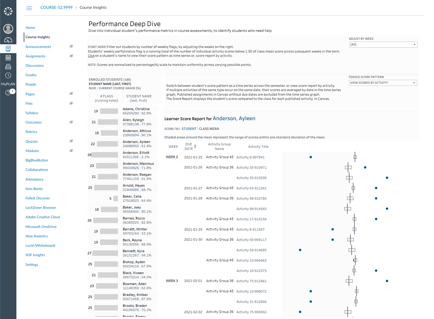
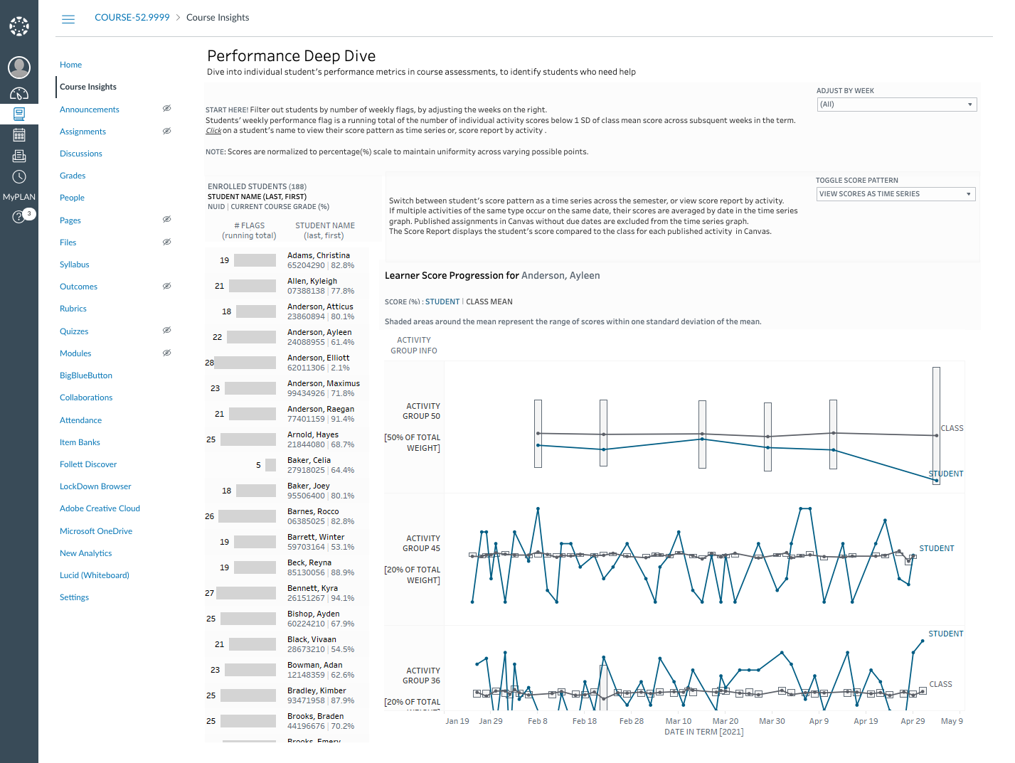
Performance Deep Dive Description
Performance Deep Dive
This dashboard provides instructors with a detailed view of individual student performance within course assessments. It allows for the identification of students who may be struggling by highlighting those with consistently lower scores compared to the class average. Instructors can filter students based on the number of weekly 'flags' (indicating scores significantly below the mean) and examine a student's score pattern
- by list of activities in course
- as time-series across the term
This helps pinpoint areas where students need additional support or where course content might need adjustment.
This dashboard empowers instructors to:
- Proactively identify struggling students based on the number of flags accumulated over the semester
- Pinpoint areas or specific assignments where students struggle and to make informed decisions to address individual student needs
- Promote student support by providing timely and targeted assistance to achieve their full potential and therefore improve their learning outcomes
activity-turn in times descriptiion
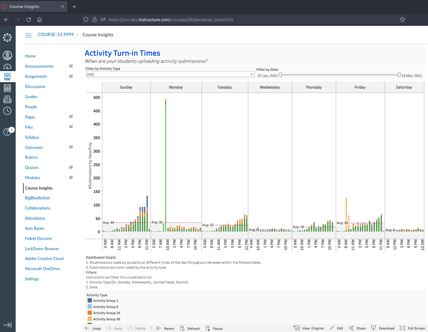
Activity Turn-in Time
The Activity Turn-in Times dashboard will help you to better understand when the students in your course are submitting assignments.
This dashboard will indicate the total number of assignments submitted each hour for every day of the week. Use the filter to view all activity types at once or select specific activities of interest, as well as narrow the range of dates over which submission behavior is shown.
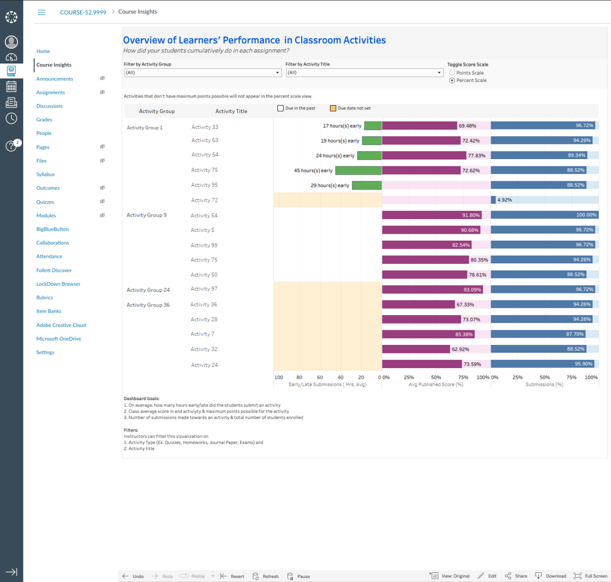
Performance Overview Description
Learner’s Performance Overview
The Overview of Learner’s Performance in Classroom Activities concisely summarizes and presents average student performance for each of your course activities. Quickly understand how many students are making submissions and meeting due dates as well as what they are scoring on your course activities.
Use the filter to restrict the view to show only activities of a specific type or title. You may find this dashboard helpful for understanding how your students’ learning is trending with respect to progression through the course.
Learners Workload Description
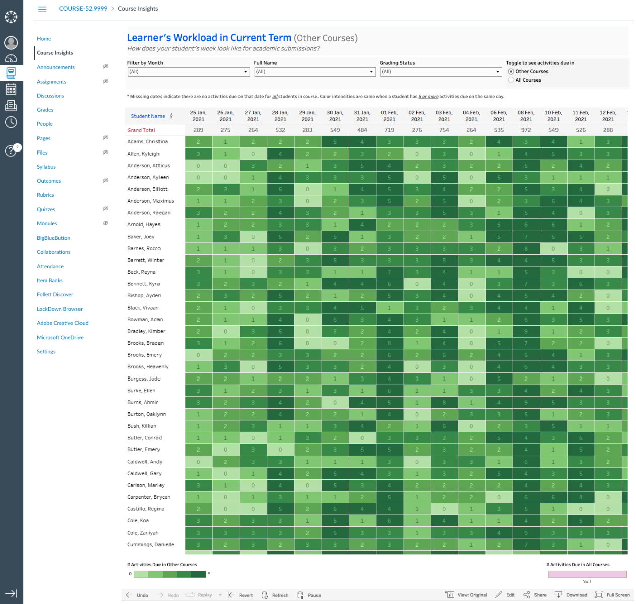
Learner’s Workload
The Learner’s Workload dashboard presents the number of activities due for each of your students across all of their courses on any given day (up to a maximum display of ‘5’).
You may choose to display results for all courses including yours or only other courses. Use the filter to narrow the date range, specify grading status, or select specific students. You may find this dashboard helpful when adjusting delivery dates for assignments or when planning future sections of your course.